Top 5 Free Data Visualization Tools Online
Large data sets are meaningless in their raw form as they do not provide much analytical value. An array of numbers is not very helpful unless turned in to a summary (aggregated) table or a visualization. The latter may be often referred to as a diagram, chart or a graph. There are various visualization tools and web based software solutions that provide capabilities to visualize data and glean the story behind the numbers.
Most advanced software tends to be pricey and unless you work for an organization which can justify such a cost, there is not whole much sense in giving up an arm and a leg to visually present numbers. Fortunately there are free data visualization tools online which can meet low to high complexity data visualization needs. So without further ado, here is a list of free data visualization tools:
Most advanced software tends to be pricey and unless you work for an organization which can justify such a cost, there is not whole much sense in giving up an arm and a leg to visually present numbers. Fortunately there are free data visualization tools online which can meet low to high complexity data visualization needs. So without further ado, here is a list of free data visualization tools:
Google Drive / Google Sheets
This platform is not just for backing up your android data and storing photos.
Google
also offers an Excel like application Google Sheets. You can transfer or upload your data from excel to a Google Sheet and use insert function to create a data viz. Go to INSERT and then CHARTS and this Google application will offer you several chart types to choose from. Options include simple bar chart, pie chart, trendline, stacked bar chart, histogram, combination of bar chart with trendline and so on and so forth. Google Sheets’ chart function is very similar to that of Microsoft Excel, so if you have used the Excel graphing function then this will be very intuitive.
Tableau Public
|
|
Next on the free data visualization tools’ list is Tableau Public. This is perhaps most powerful free visualization tool which is capable of producing most visually striking data visualizations. You can create very cool interactive data visualizations for free and then embed them into your blog or share over the web. Using Tableau Public does not require knowledge of coding and is fairly intuitive. Using this Tableau application certainly requires a bit more skill than using Google Sheets, however once you master report building in
Tableau Public
it will bring your data visualization game to a whole new level. You can create various types of charts and can also overlay graphs on maps. You can find some very cool interactive reports at
Tableau Public Gallery
.
Datawrapper
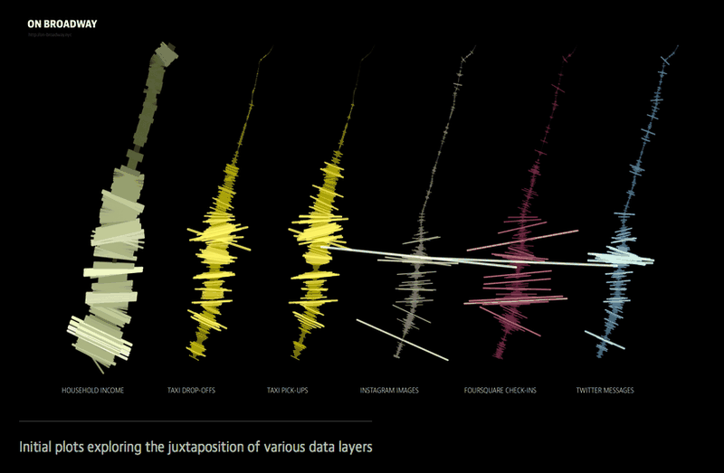
If you prefer a visualization software which is simpler and quicker to use than Tableau, but still offers more sophistication than Google Sheets, you can try out
Datawrapper
. In simple four steps you can create a data viz which will help you get visual insights into data as well as share them with others. Pasting the data or uploading an excel spreadsheet will get you started with this free data visualization tool. If you do not have a dataset handy and would like to see how this web based data visualization application works, you can always use sample data sets made available by Datawrapper developers. Once you add your own or sample data, you are directed to the next step where you can review the data setup and make corrections if necessary. Third step – “visualize” - is where you choose a diagram which best fits your needs. Datawrapper offers bar, column, pie, grouped column, line, donut and election donut charts. You can also create a map or a table. In order to get your hands on the visualization you will need to open an account which is free.
Raw

Another web based visualization software from the “quick and sophisticated department” is Raw. If I were to pick an application from this free data visualization tools’ list for quick turnaround with visual complexity, I would most likely go with Raw. You get started with pasting raw data into a data field. Similarly to Datawrapper
Raw
offers sample datasets to play with. Once you provide raw data or choose a sample dataset, you can choose a chart type. Here is where Raw stands out from the crowd offering some pretty innovative and complex visualization layouts. You can choose clustered force layout, alluvial diagram, bump charts, circular dendrogram, streamgraph, Voronoi Tessellation among others. After choosing your viz layout you can map dimensions and apply customizations to give final shape up to a chart. You can download the data visualization or get an HTML code and embed it in a webpage. All this is free.
Timeline.js

The last entry on the free data visualization tools’ list is a web based application which I would classify as a hybrid tool for data visualization and slide show creation. If you are trying to develop a creative timeline viz then this website is the place to go. And again you can create a timeline visualization in four steps. First you need to create a sequence of events using Google Sheets provided by
Timeline.js
and then import a link code. You can customize and preview your dynamic slide show and add it to a website or a blog page. This visualization tool has been used by such big names as Time, LeMonde, Denver Post, Al-Jazeera and others.
Click here
for an example of interactive timeline visualization dedicated to life of Nelson Mandela.