What Is Big Data Analytics
What Is Big Data Analytics
Big data are large sets of data that due to its size or type cannot be captured, managed or processed by traditional databases. Big data usually have at least one of these characteristics: high variety, high velocity, or high volume.
You can collect big data from the most varied places: from the web, social media, log files, video or audio, sensors, transactional applications, and devices. The most part of big data is generated on a very large scale and in real time.
So, in order to collect, organize and analyze the big data, you need to use big data analytics.
Big data analytics main goal is to help companies discover any patterns they might be missing that can help their businesses. Either by answering specific questions, as it can also help to improve operations, increase efficiency, improve risk management, boost sales, and even improve your customer service.

Companies now use a lot more data than they used just 5 or 10 years ago. And when you want to do big data analysis, you need the data to be beautiful, but mostly, you want the data to be useful, and to show multiple dimensions.
And this is where visualization comes in. With big data visualization, you not only look at the data, but you can also interact with it. The big data visualization needs to be easy to use, meaningful, understandable, approachable, and well-designed.
With more and more data needed to be analyzed, technology evolves, just like big data visualization tools evolve. They need to be faster, more intuitive, more interactive.
Here are some of the visualization tools for big data you can use:
Ember Charts
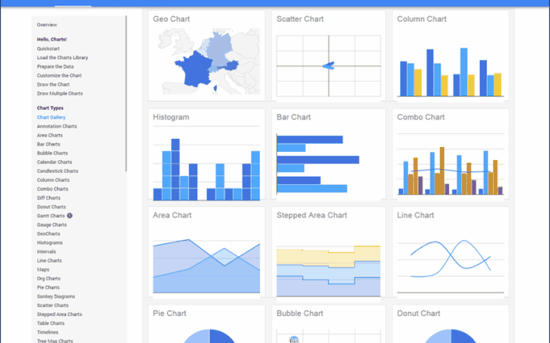
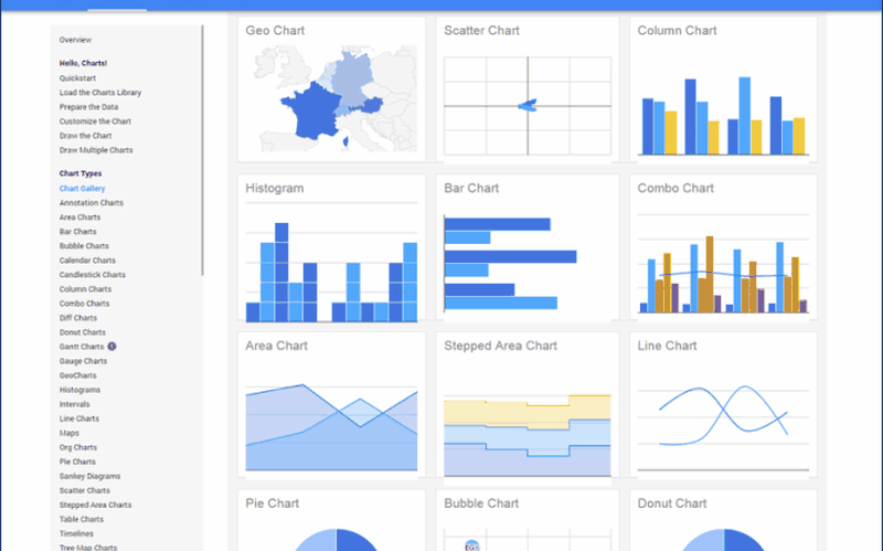
Google Charts
FusionCharts
FusionCharts include more than 900 maps and 90 charts. One of their great features is that you don’t need to start from scratch. They already include hundreds of live examples you can use and make your job a lot easier.
FusionCharts is a great visualization tool for big data that allows you to edit your charts the way you want (like changing fonts, colors, etc.), but it also gives you great control over how charts behave under different scenarios.
HighCharts
SAS Visual Analytics
CrossFilter
With CrossFilter , you can explore big data with more than a million records. They use objects, values and other commands and components for the visualization.
Envision.js