Interactive Data Visualization Shows Reality of NFL Fans
Interactive Data Visualization Shows Reality of NFL Fans
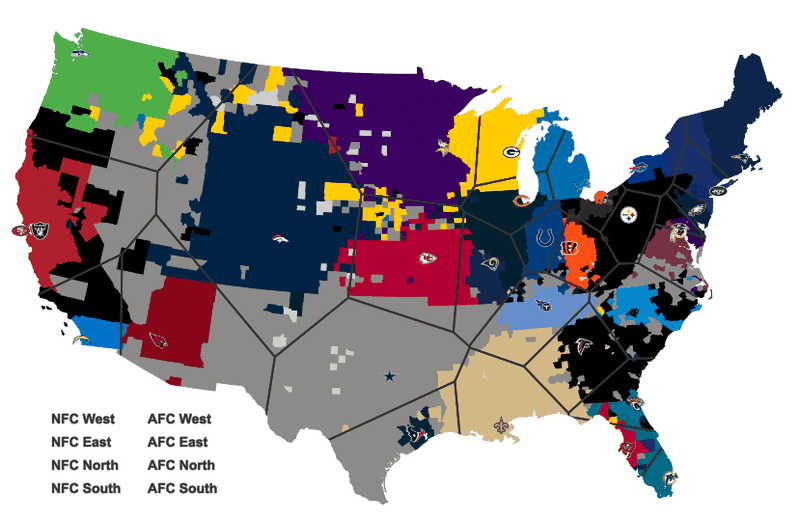
Veltman started creating this interactive data visualization by outlining the area teams may claim if fans were decided by proximity. Using Facebook likes, the actual popularity is mapped out for viewers. By hovering over a region, the fan base becomes highlighted according to color. Clicking on the region keeps the space highlighted but can be erased by clicking once more on the interactive data visualization. Veltman admits Facebook likes are not the most accurate way of measuring fans and some counties may have had a close runner up. Yet, it has some interesting results. The NBA, NHL, MLB, and MLS territory maps can be found on this site and are based on the nearest stadium.
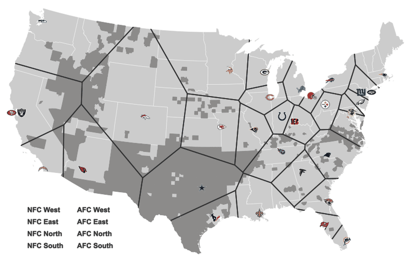
Veltman started creating this interactive data visualization by outlining the area teams may claim if fans were decided by proximity. Using Facebook likes, the actual popularity is mapped out for viewers. By hovering over a region, the fan base becomes highlighted according to color. Clicking on the region keeps the space highlighted but can be erased by clicking once more on the interactive data visualization. Veltman admits Facebook likes are not the most accurate way of measuring fans and some counties may have had a close runner up. Yet, it has some interesting results. The NBA, NHL, MLB, and MLS territory maps can be found on this site and are based on the nearest stadium.